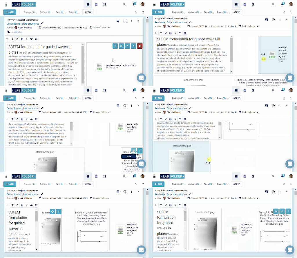
When designing our electronic lab notebook (ELN), one of the most important things we aim to achieve is to ensure that our users have as much flexibility as possible so they can tailor Labfolder to meet their specific research requirements and personal preferences. That’s why today we are thrilled to announce that we’ve released an update to our grid layout feature. We now allow users to input up to twelve resizable and movable elements next to each other within their Labfolder entries. This updated feature facilitates data entry and project organization, giving our users maximum control over the appearance of their entries within our ELN.
Before, it was only possible to have two entries side by side, now the maximum is twelve, giving our users the ability to customize their entries as they see fit. Noticeably, this feature also allows users to freely move and modify the sizes of the elements within an entry. A click will add the element to the bottom of the entry, if there is still space on the previous row it will go next to the last element created. Simply adjust the element size, then drag and drop the elements into the desired location. In this way, our grid layout feature streamlines data documentation, giving more options to our users.
Take a look at how easy it is to do!

We aim for our platform to provide scientists with the best possible experience, with not only robust features that facilitate standardization and compliance, but also features that give our users the ability to get creative and store their research documentation however they wish. As always, we’re keen to hear our customer’s feedback, so please feel free to submit your thoughts or ideas to feedback@labfolder.com.
Nice! When will this be rolled out for the local server versions?
Thanks André, the roll out to the local server versions is planned for the next on-premise release, scheduled for early April – we’ll keep you updated.